Ideation Phase
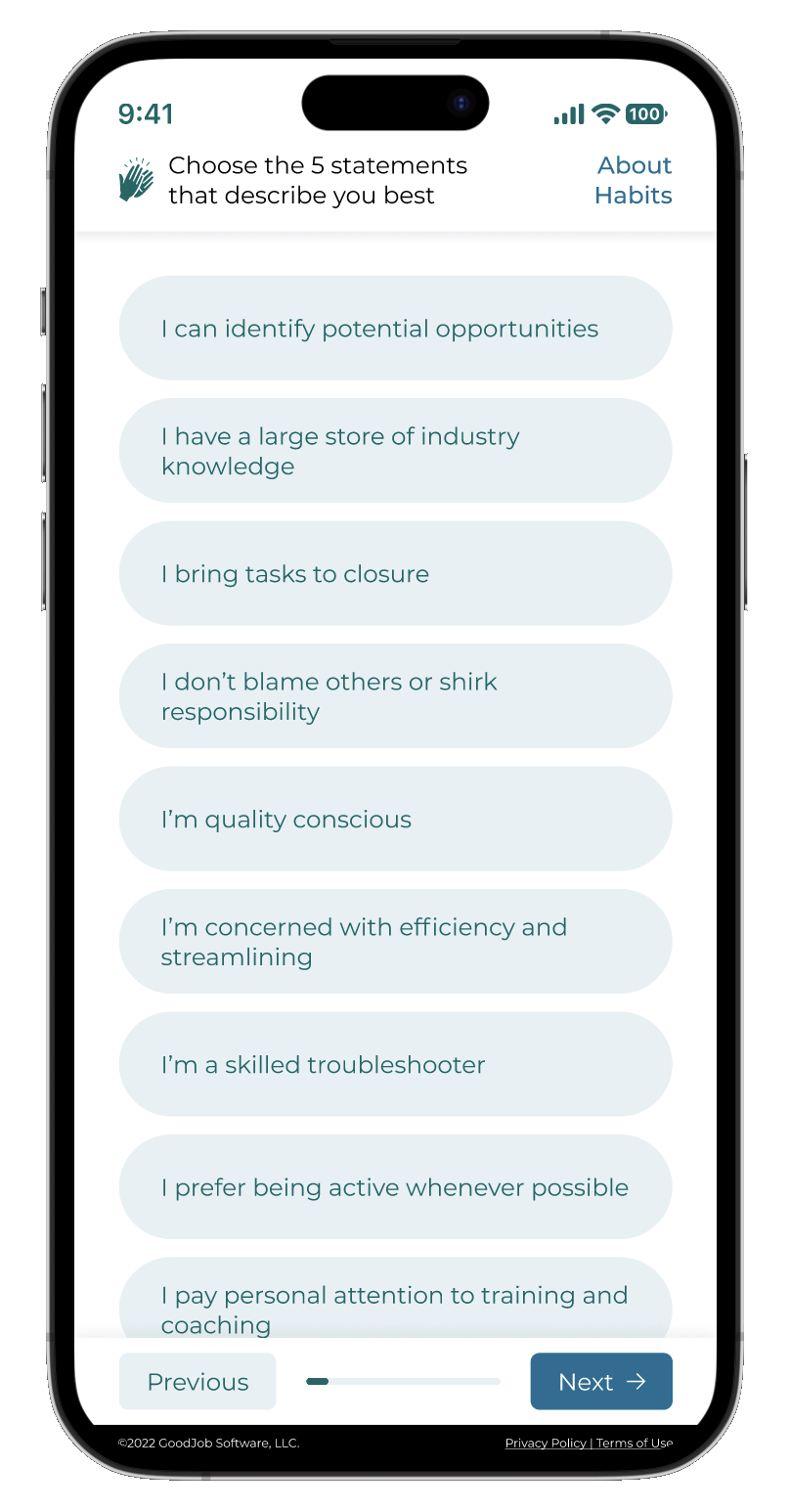
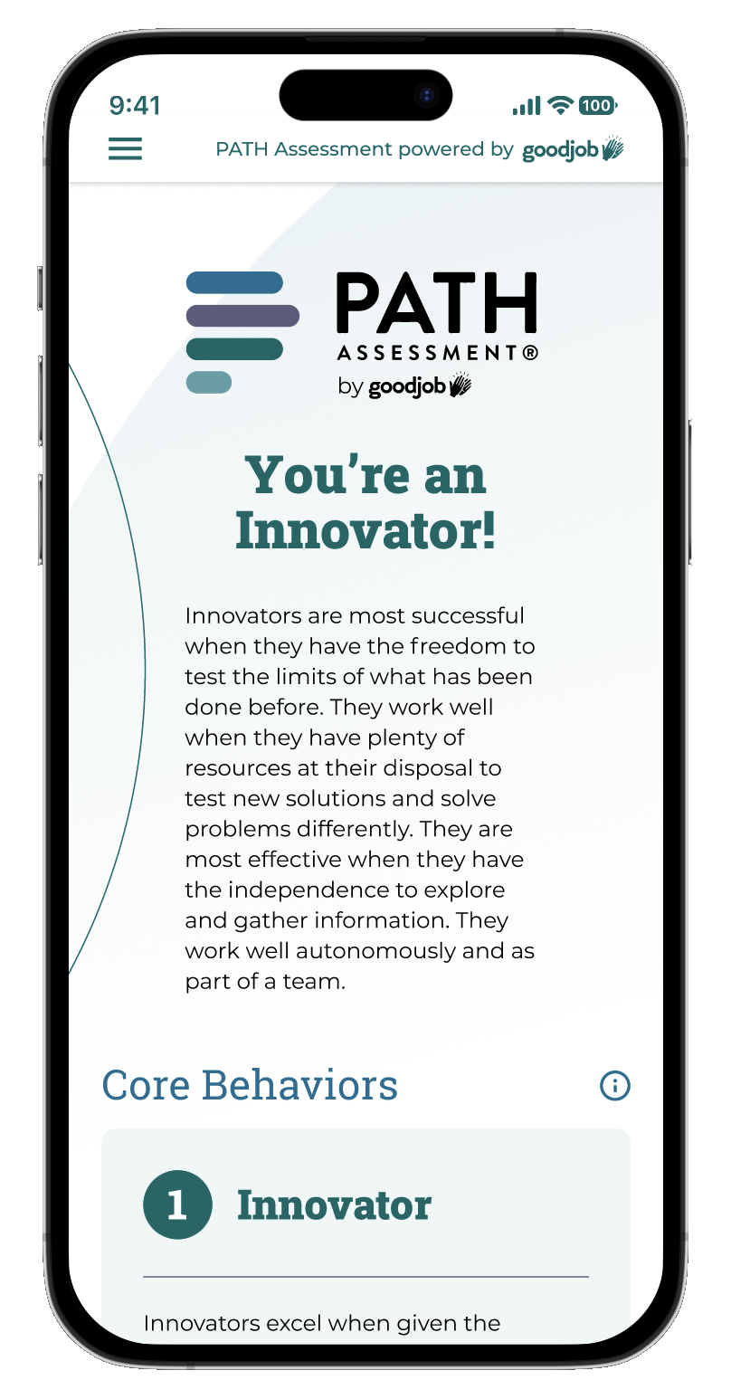
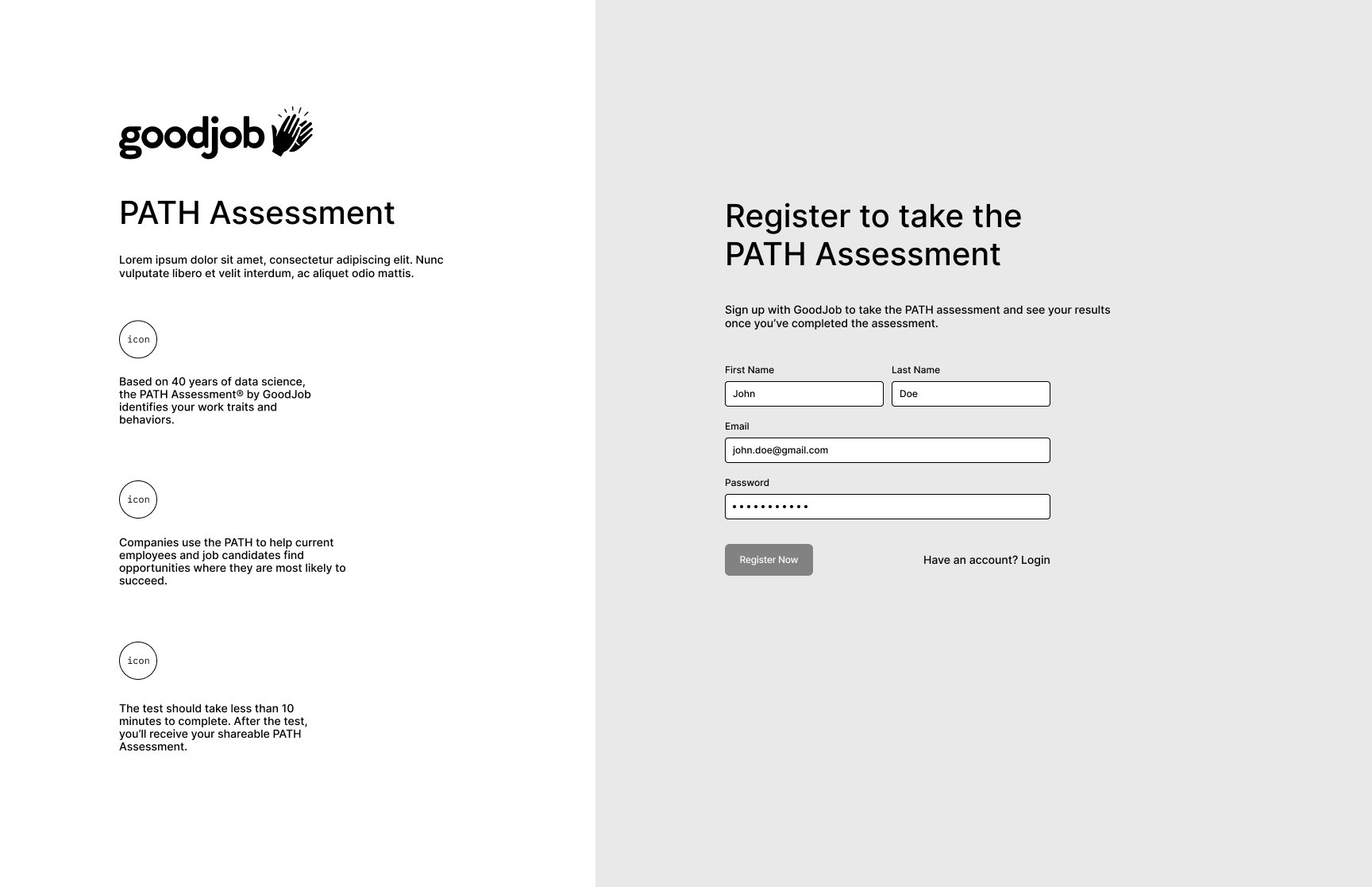
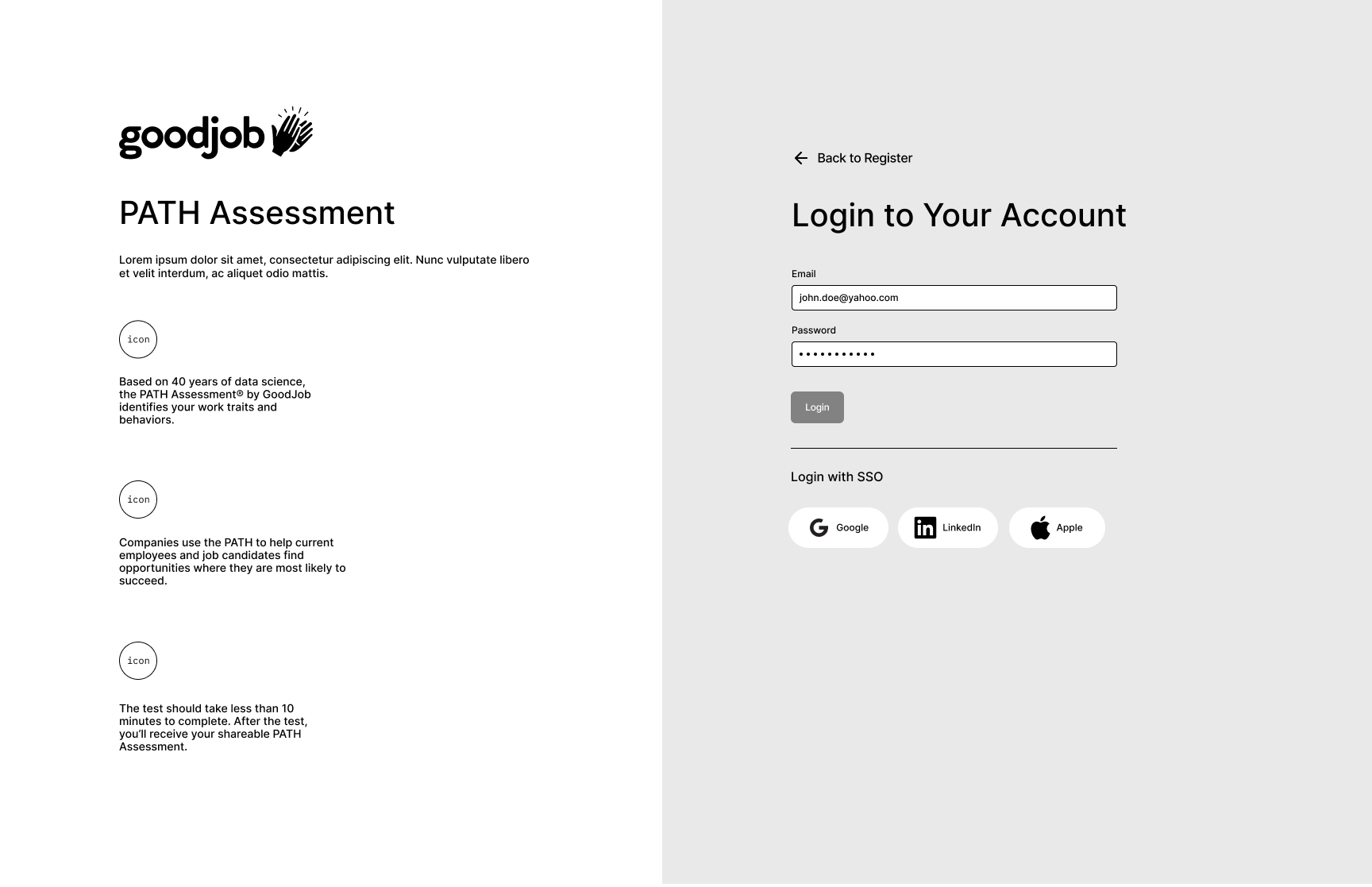
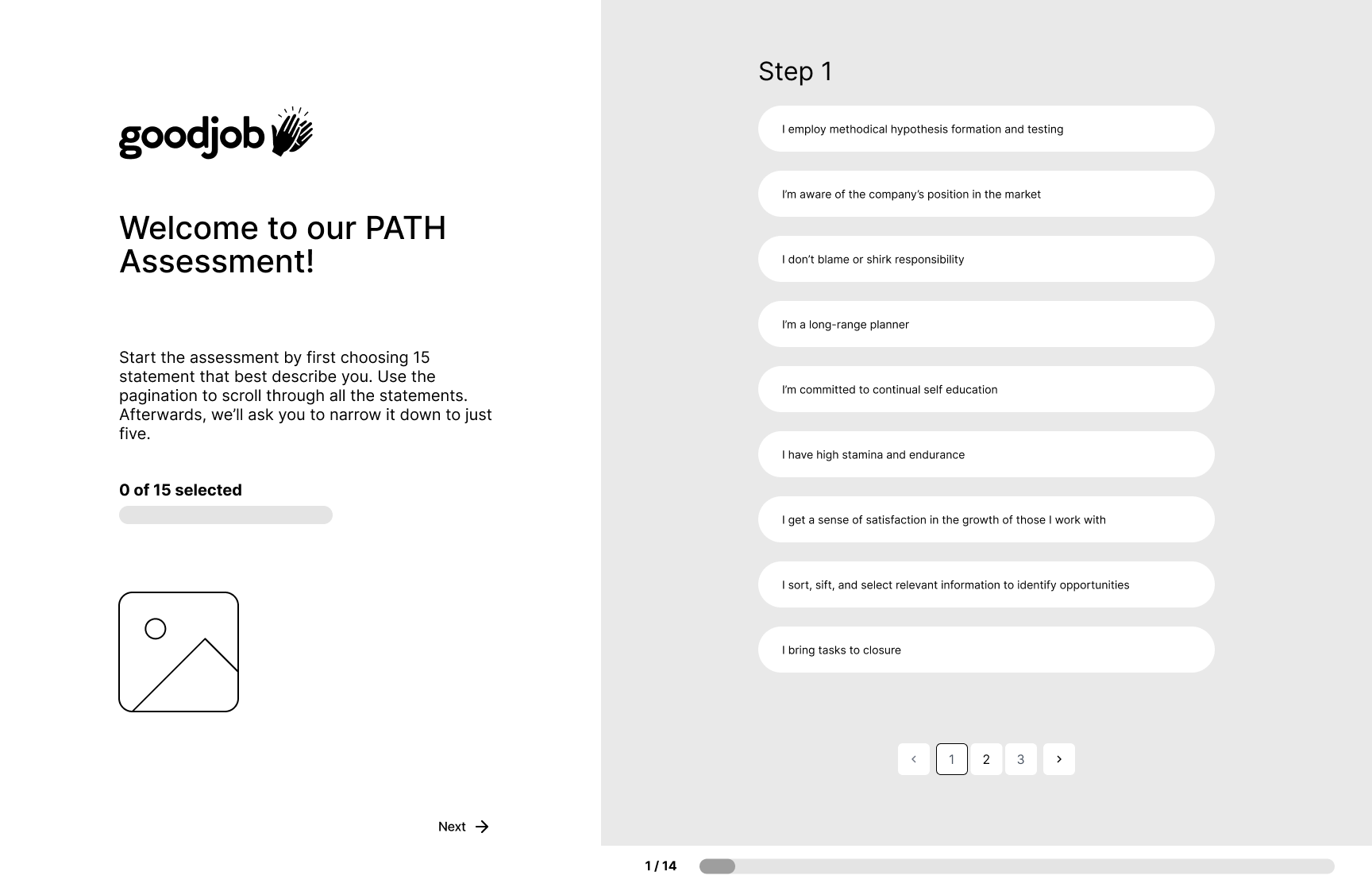
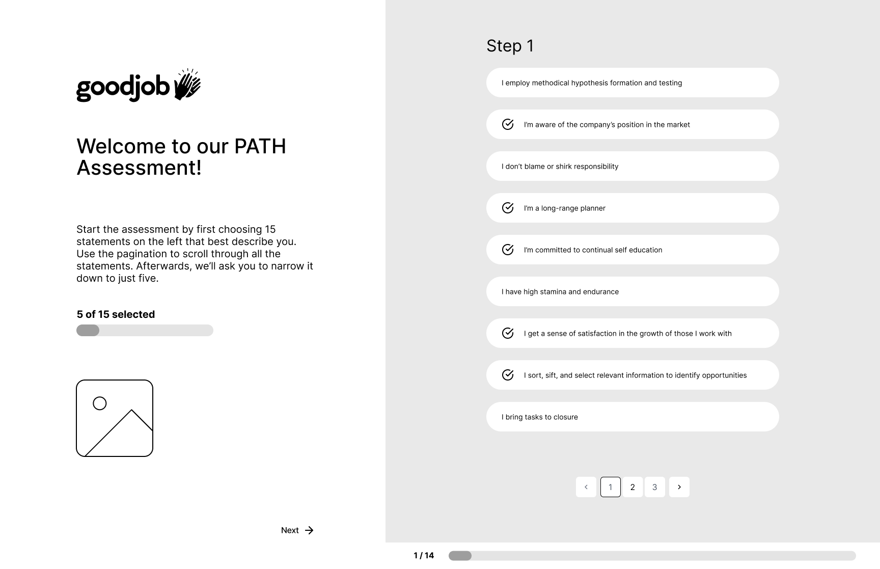
Our goal was to enhance PATH by rebranding the experience, improving the progress indicator, adding a login splash page, and creating a mobile-friendly version.
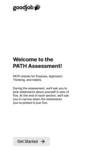
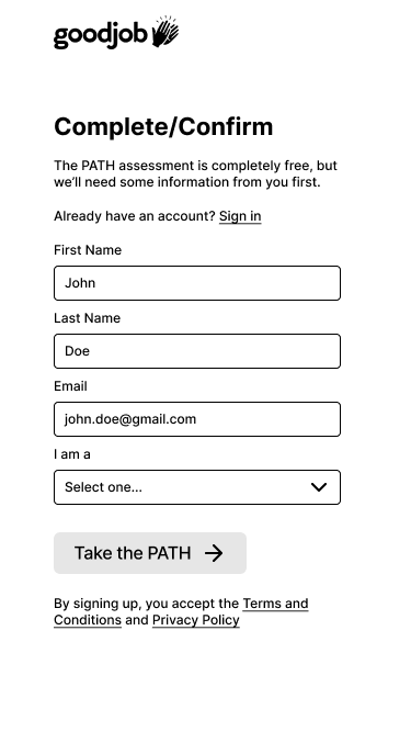
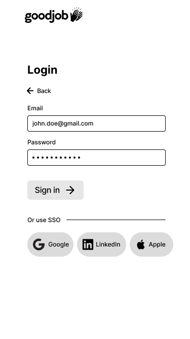
While at Goodjob, I led a comprehensive redesign of the PATH Assessment, a behavioral science-based tool matching optimal candidates to the right roles. Despite its effectiveness, the assessment suffered from a poor user experience and outdated design. This case study outlines how we transformed the PATH assessment into a modern, user-friendly platform that accurately reflects its value.
The legacy PATH Assessment was plagued by a host of usability and design shortcomings. Its visual style was outdated and inconsistent with Goodjob’s evolving brand identity. Moreover, the user interface was cumbersome, with poorly placed buttons and unclear instructions hindering the end user experience. To compound these issues, the progress bar was unreliable, often misrepresenting the user’s advancement through the assessment.


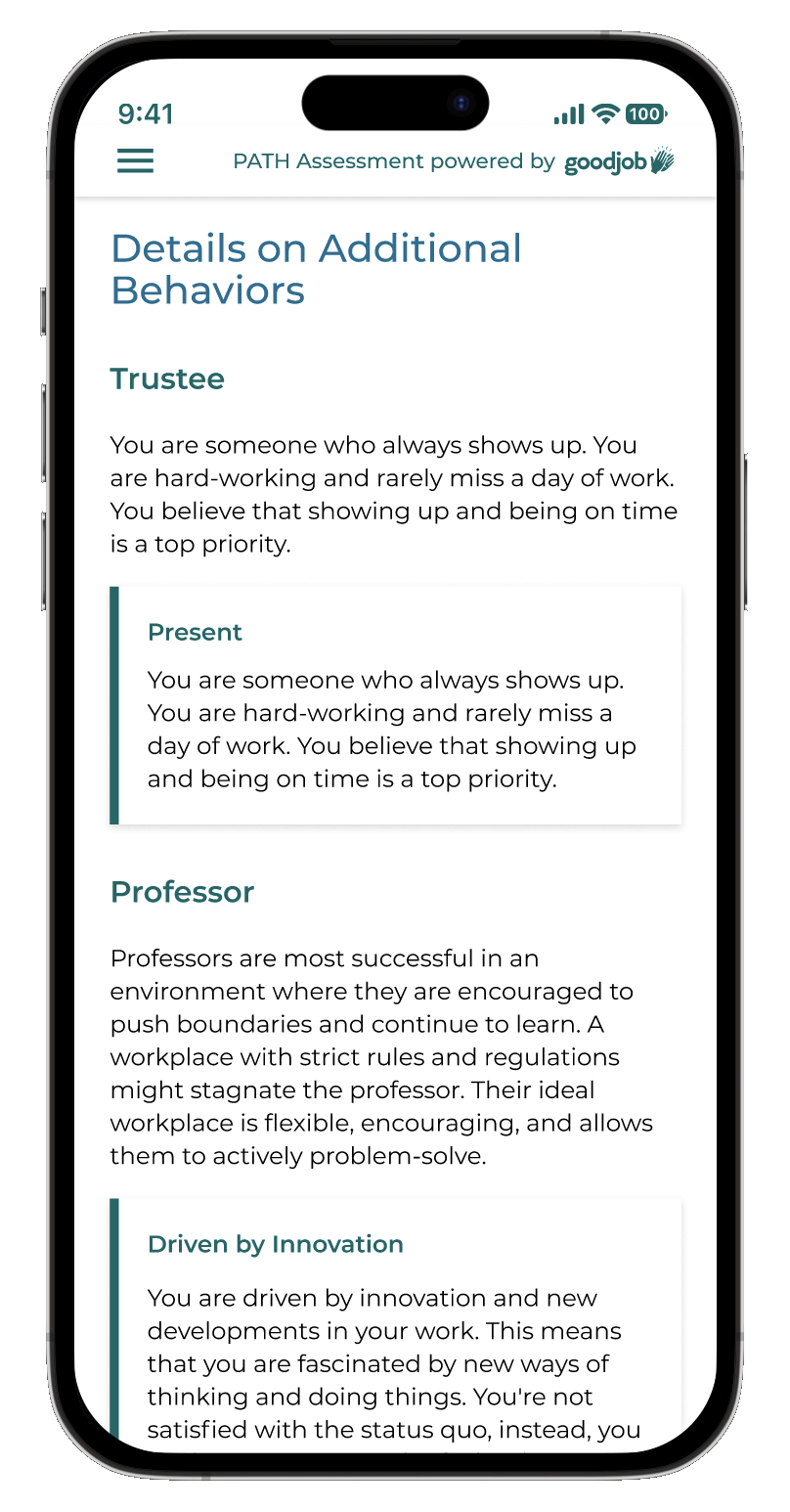
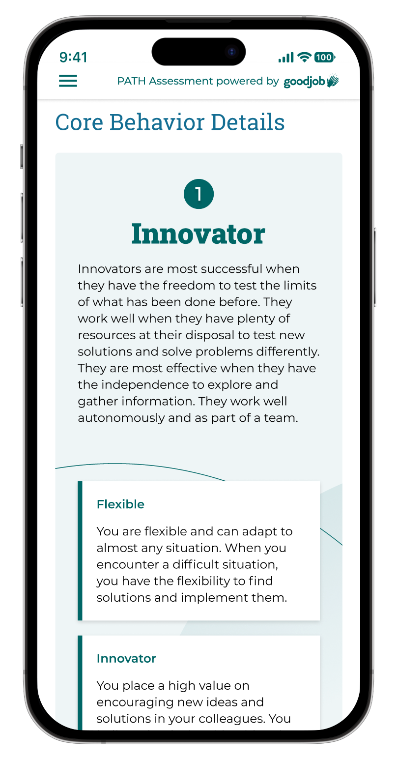
The final result culminated in a revamped PATH Assessment that aligned seamlessly with Goodjob’s recent website rebrand. Through intensive brainstorming and wireframing, we prioritized a mobile-friendly experience, redesigned the login splash page, and streamlined the results page. Additionally, we simplified the progress bar and refined the assessment’s language for clarity, resulting in a more intuitive and engaging user experience.

